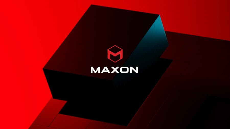
After more than 20 years, Maxon has unveiled a new corporate identity. The move follows the completed unification of Maxon global in 2018, the acquisition of Redshift in 2019 and the merger with Red Giant in 2020. Senior Brand Manager Leo Hageman designed the logo under the direction of Maxon’s executive team.
“After bringing the Maxon, Redshift and Red Giant teams together, we felt it was important to establish a new look and feel for Maxon,” said CEO David McGavran. “This new logo is an important part of that identity. We wanted something that embodies our unified product lines, passionate team and shared goal of empowering creatives.”
Once finalized and registered, Maxon enlisted the talents of Toronto-based animation and design studio Tendril, who brought the logo to life in a 15-second animation, as well as a shorter, 3-second version. “We wanted something modern, a stand-alone mark that suggested both dimensionality and unification,” Hageman explained.
Relying primarily on Cinema 4D and Redshift, Tendril created several different animations of the cube coming together in various ways. “It’s always hard to represent a 2D logo in a three-dimensional world, so we explored that a lot with Maxon to make sure we were representing the logo in the correct way,” said Tendril Art Director Rita Louro.
The final version uses lighting and textures to balance technology with the human touch as each piece of the cube moves smoothly into place. “It really came down to connecting everything together in a soft way and, because it was a reveal, we used darkness and light to add some mystery,” said Tendril Creative Director Nidia Dias. “Ultimately, it’s something that can stand the test of time, and it was a really fun project to work on too.”
Join Maxon for its 3D and Motion Design Show on April 13, 2021 to April 15, 2021 to find out more about Maxon’s new corporate identity and enjoy presentations by our latest lineup of noteworthy creative directors, motion designer and animation directors.

